LET’S STEAL FROM THIS! Amy Bloom, Comics, and Maximizing Words + Images
LET’S STEAL FROM THIS! is a series of pieces looking at what fiction writers can borrow, craftily, from other sources. I will mostly look at television, movies, and comics, though the occasional literary work may squeak its way in, as will a song or two. LET’S STEAL FROM THIS! finds useful inspiration in unlikely places.
I said in the last post that I’d be talking about Breaking Bad. I will, I shall. But in the wake of that last piece, I had two experiences: 1) For the most recent WHAT ARE YOU READING? podcast, I interviewed Jordan D. White, an editor at Marvel Comics; and 2) I was invited to talk at the Westport (CT) Public Library to help kick off NaNoWriMo. (No, I don’t think a National Novel-Writing Month is dumb or a waste of time. I think complaining about it is.)
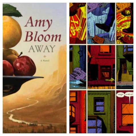
My library talk was about reading for writers, and was meant to be a look at the “why” behind certain choices or techniques in fiction. (I subtitled it “Learning How the Nuggets Are Made.”) One of the things I looked at was the amazing first chapter of Amy Bloom’s novel Away, a book I’ve surely mentioned a few times in these pages. Away knocked me on my ass when I read it, and I’ve taught it quite a bit since. One of the things that makes Away so good is its compression — a topic I already used for my Gravity post (shit!) so I can’t do that here. I’d love to say it’s a novel only a short-story writer could have written, but I think that’s shortchanging the talents of Amy Bloom, who can seemingly write anything and make it great.
But one of the things that makes Away work so well is the way it starts, and the way it starts is actually very comic-book-like. Which is ironic, since the book it most immediately resembles is The Amazing Adventures of Kavalier and Clay, a novel about comic-book people written by a comics fan which yet does very little to mimic comics storytelling. I love Kavalier and Clay, and it certainly features a lot of comics-related material, but it has more in common with a Dickens novel.
Away‘s early chapters work their magic via what my kids’ elementary school teachers used to call “text-to-text” and “text-to-life” connections. In grownup terms, this is semiotics, but that’s a deep specialty and I am a piker, so I’ll stick close to familiar trails. What I’ll say is that at some point in the consideration of her first chapters, Bloom clearly recognized that there are things we ALL know and have heard/read/seen about the immigrant experience in New York in the early 20th century. So she could have given us 80 pages of her hero, Lillian Leyb, getting on the boat, the rough ride across the seas, being shuffled through Ellis Island, arriving on a blaring Lower East Side street in 1924, etc. etc. And she will refer to those things in the coming pages. (By the way, if you click on the link to the book, you can use the Amazon “Look Inside” feature to read most of the first chapter.)
But what Bloom starts with, instead, is this:
There are one hundred and fifty girls lining the sidewalk outside the Goldfadn Theatre. They spill into the street and down to the corners and Lillian Leyb, who has spent her first thirty-five days in this country ripping stitches out of navy silk flowers until her hands were dyed blue, thinks that it is like an all-girl Ellis Island: American-looking girls chewing gum, kicking their high heels against the broken pavement, and girls so green they’re still wearing fringed brown shawls over their braided hair. The street is like her village on market day, times a million.
There’s a LOT going on in that graph. One: we’re given the cacophony in context — is it car horns and fish mongers? No, it’s 150 young women spilling out into the street.
Two: We meet our hero in the middle of this scene, and we are immediately given key info about her: She’s been here for 35 days already (what was the boat ride like??), and that’s been long enough for her to no longer feel like a newbie. You know, though it’s not yet said, that she’s not wearing fringed brown shawls over her braided hair. You understand something about her by contrast. Think about that: would you feel like a pro after 35 days in a new country halfway around the world? Probably not, so this gives a sense of the accelerated whirl of the immigrant experience in that era: assimilate or (literally) die. At the same time, it tells you something about our main character, Lillian: She’s smart, and she’s a survivor.
Also crucial in this first paragraph: Lillian’s not looking for her first job, as any other book would have her do; she’s looking for a better job. Which tells you something more about her character — she’s not just a survivor, she’s driven. She’s not going to settle for “good enough.” Finally, you get the sense of where she’s from: A village with a market day. That’s far-flung from wherever we are now, isn’t it? (And yes, you get the mention of Ellis Island, which is all the Ellis Island you really need in this story at this point.)
So it’s a bunch of signifiers, and it’s intensely visual. Sound like something else?
If you haven’t read a comic book or graphic novel (they are not the same thing) in a while, go do so. If you’ve never read one, go find one. If you don’t have a comics shop near you, go to a bookstore and look in the magazine section, or in the Graphic Novels section. Or go to Comixology and browse any of the titles — they have a Look Inside-like feature.
It’s been said (and I wish I’d been the first to say this) that comics teach you how to read them. I’d argue that prose books do, too. Most people put a lot of thought into having a grabber of a first line, or of having something big happen in the first chapter. The idea is hooking the reader and convincing them to keep reading, and I see this advised again and again in writing-craft books. And it is good advice. But the other purpose of a first chapter is to show your reader what kind of book this is going to be. It’s a gauntlet. A great first chapter will leave you feeling a little disoriented afterward, because you’ve just been living in a different atmosphere for twelve or twenty pages.
This is how I feel after I finish a comic. Part of the thrill of comics for me, in fact, is the same thrill of reading prose: assembling and understanding what’s in front of me, adding my (reader) stuff to the other (writer) stuff to make a complete experience. The difference, on the face of it, is that comics use visuals as well. An artist works with the writer to create this experience, whereas in prose the writer is also the artist. But the job is the same, whether it’s one or two people. (Or more — different people may do the pencils, inks, and colors for a comic.)
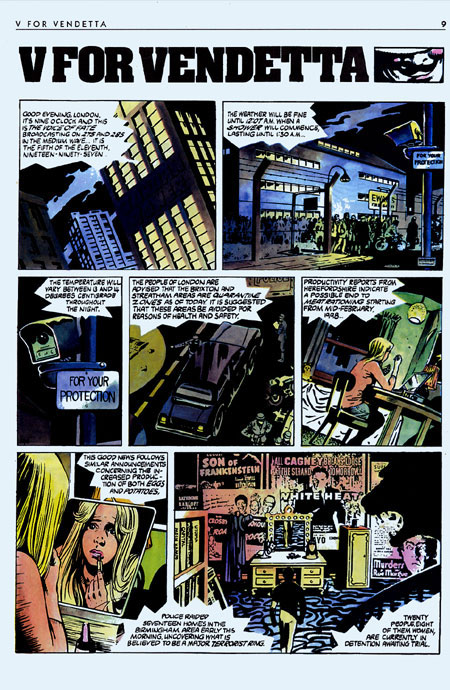
Here’s the first page of Alan Moore’s V for Vendetta:
Lot going on there, right? Not on the level of Away, necessarily, but enough that will come to matter as the story unfolds: Visual cues to a locked-down version of London; big, organized crowds of people; a reference to women being detained, which will very much matter later in the story; and those cloudy night skies.
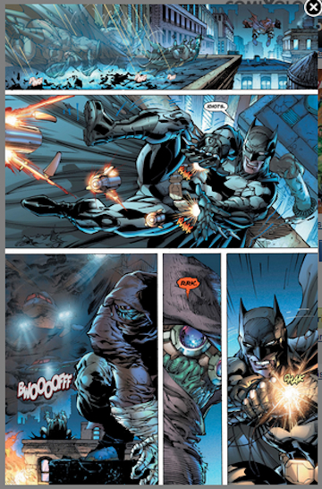
Now here’s a random (not first) page from a Justice League comic:
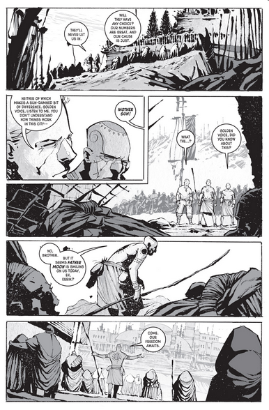
Certainly simpler, in terms of visual clutter and orientation, but you still need to do the work: Okay, Batman’s here, then he’s here, but then there’s someone he’s pursuing, and are we supposed to know who that is? (I think it’s Killer Croc, but I’m not sure.) There’s a tightness to the shots that contrasts deeply with the smaller, yet more distant panels from V for Vendetta, and also with the widescreen opening paragraphs of Away. Here’s a third sample, from Antony Johnston’s Wasteland:
And here we have a mix of the grand and the personal, the wide and the tight. I will tell you, as a regular reader of Wasteland, there’s a physical similarity to the characters that is made even trickier by the black & white artwork. There are entire pages where I have no idea who’s talking to whom. And this is okay. Because Antony Johnston knows, and he’s careful to make his characters distinct in their language and in their motivations. So it’s my job to remember which character would be for the slave rebellion and which would be antsy about it.
Three completely different comics, three completely different atmospheres, each with its own quirks of visual and textual language. When you look at these, think again of Away, and how it starts not with a warm hand on your shoulder but a shove — In you go! This is storytelling that is concerned with compression, yes, but also with giving the reader an immersive experience, possibly at the expense of easy reading.
When my students read that first chapter of Away, the most common response can be paraphrased as this: “I didn’t know where I was or who I was reading about at first, but then I got it. By the end of the chapter I felt like I’d really experienced something.” That chapter, by the way, is the most agreed-upon reading I’ve ever assigned. Not everyone likes the stories by Richard Bausch or Grace Paley, but everyone, so far, has agreed Away is a hell of a piece of writing. Also important to note: not everyone feels like reading the rest of the book after that. The first chapter features a scene of incredible violence that, while completely necessary, can be a real challenge.
A very close second to Away, among my classes, is Edward P. Jones’ story “The First Day,” which uses a similar set of tools. I won’t go into that story here (read it at the link!), but it, like Away, is an origin story. Meaning: It contains the moment that has undeniably transformed our main character into something more than they were, and tragically so.
“Origin story” is a comics term, but it’s a principle that did not start with comics. We know Peter Parker’s origin story — it was tight enough to be compressed into a caption at the start of the daily Spider-Man comic strip that used to run in newspapers when I was a kid in the ’70s. But we also know David Copperfield’s origin story, and Tom Jones’, and Moses’ and Odysseus’.
Which reminds us, I hope, that comics aren’t some weird new medium — cave paintings? Hieroglyphics? — that’s rotting our kids’ minds and pulling adults away from supposedly more legitimate forms of literature. In fact, they’re insanely sophisticated. They demand an active, immersive reading experience, and they reward thoughtful readership. As does the very best prose literature, like Away.
Here’s what to steal from both Away and comics:
- Make your reader do the work;
- Make that work rewarding;
- Use your reader’s knowledge of the world to condense and compress key information. Don’t submerge us in details and backstory when a (keenly wrought) reference or hint will get the job done.
- What’s shown is what matters to the story and the character. That’s it. In a comic, there’s simply no room in the frame for anything that doesn’t help tell the story. Why should it be any different for a paragraph of prose? Think back, again, to that first section of Away.
- Following on #4, use signifiers — symbolic shorthand — to supercharge your images. If these things are tied directly to your character’s experiences or perceptions, we’re suddenly inside your character, and we’re experiencing them more vividly than we would with pages and pages of backstory and musings. It’s not just that young women are lining up for jobs in 1924, or that they were doing things like ripping the stitches out of silk flowers. It’s that Lillian is, and that she’s looking for something better. Inside of three sentences, we have the shape of a character. Voice and image are working together to do this, exactly as they do in the best comics.
- For god’s sake, be interesting. Are you a prose writer who complains about readers being drawn to comics and other visual media? Try offering something more. By compressing the way she does, and by always picking the details that most matter to her story and her character, Amy Bloom makes even the most mundane moments feel exhilarating.
Next time, by hook or by crook: Breaking Bad and the question of “evil.”


One Response to “LET’S STEAL FROM THIS! Amy Bloom, Comics, and Maximizing Words + Images”